People today do a lot of research online before calling to make an appointment. They look at the menu, compare prices, read reviews, and do a lot of other things that could affect their dining choice. If you can impress these food enthusiasts with your website then your business will grow. Just like that. The only problem is that you risk losing a potential customer’s business if your website lacks professionalism, appears old, or does not provide the information they need.
The aesthetics of your restaurant’s online presence are important, but there are more considerations. There is a lot more work that goes into creating an attractive website for a restaurant, but it is essential to ensure that your site looks excellent and attracts potential consumers. That is where Squarespace’s restaurant website design templates come into play.
Look no further if you are seeking inspiration when developing a Squarespace-powered restaurant website design; this article will break down some of the top restaurant website templates, by the best restaurant website creator, Squarespace!
What to Keep in Mind While Making Restaurant Website Design?
Things like these matter a lot.
- Location of SEO data helps you rank in your local area
- Photos of your restaurant and food without any surprises
- Access to your menu so people can see what you offer
- Highlighting deals and offers because everyone loves a good saving
- Contact and location information
- The capability to reserve a table or set a date
- Great copywriting
Free Restaurant Website Templates on Squarespace
1. Auburn
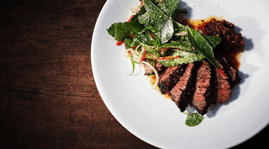
You may showcase your restaurant’s most photogenic dish as the centrepiece of your Auburn website with a full-screen banner photograph. When it comes to restaurant websites, this restaurant website design has all you could possibly want and more. Your restaurant’s address, a page for taking bookings, and a page with the menu are all here. To make it easy for your site visitors to access your social media channels and reviews on sites like Yelp, the social buttons are prominent in the upper right corner.
You can also utilize Auburn’s News page as a blog to share news about your restaurant, its chefs, or forthcoming events. Diners can easily find you or get in touch with you because your location, hours, and contact information are all included in the footer at the bottom of every page. Check out Squarespace for more!
2. Juniper
Juniper shares many of Auburn’s appealing features and design aspects. Some examples of these elements include the homepage’s full-screen hero image, social media connections, and the footer’s location and contact information.
Juniper, on the other hand, is less ornate than Auburn. Different menus and reservation forms are accessible via separate text links on the homepage. Menu items for food and drink are already linked, but you may easily change them to match your needs.
In addition to main menu items like appetizers and desserts, you can further refine your menus via submenus like “garden,” “sea,” and “land” on the menu pages. Include photos of your meals on the menu and much more!
3. Palmer
Palmer is different from the other designs I suggested. It allows the full-screen image to showcase your mouthwatering food without any text or links being superimposed on top. This helps your website appear more polished, which is why Palmer is perfect for upscale eateries.
You can access the complete menu by scrolling down the restaurant website design, where you’ll also see a section with links to individual menu items. Palmer comes with a beautiful grid-style gallery and more picture space, so you can showcase your restaurant’s best dishes in all their glory.
On top of that, there’s a place for testimonials, a map to show you exactly where you are, and a special “Press” page where you may showcase quotes from reviews, magazines, or newspapers.
4. Hill
The combination of text and images on Hill makes for an interesting and engaging website, which is why I appreciate it. Plenty of room on the homepage for you to showcase your cuisine and tell the story of your restaurant, including where you get your ingredients or how meticulous your chef is when making meals.
The impressive design also includes strategically placed buttons to encourage visitors to book a reservation and connections at the bottom to other useful sites like Menu, Our Story, and Contact. You may reach a wider audience with your site thanks to the integrated social media links to popular restaurant-focused platforms like Instagram and Facebook.
Installing an e-commerce platform on your restaurant’s website to offer takeout, meals, and gift cards is a breeze. If you’re a restaurateur seeking a simple design, this restaurant website design template is perfect for you. To know more check out Squarespace now! The best restaurant website builder!
Tips and Tricks to Building Restaurant Website Design on Squarespace!
Put your menu front and center
I’m not talking about displaying it physically, but customers want to see what your menu offers when choosing where to eat out, so make sure you’re making it as easily accessible as possible.
Optimize the content
Here, a well-written copy can make all the difference. Optimize your website for search engine rankings by using keywords, and make sure it’s easy for customers to read. Doing so will increase the amount of organic visitors to your restaurant’s website.
Include professional photos of food & restaurant
Particularly if your line of work involves appetizing food, this is crucial. In addition to looking fantastic on the internet, this will also encourage people to dine at your restaurant. Having high-quality images of your restaurant’s location also helps establish credibility with potential customers.
That way, people can be confident they will feel at home during their visit and there will be no unpleasant shocks. Maximize your success by focusing on your target market!
Use a smartphone for pictures
If we’re talking about taking pictures, you won’t need an expert to do it. Take stunning images with your smartphone. Using them effectively doesn’t require them to be flawless. Using customer images in your restaurant website design is also helpful. Sharing images taken by you is something that most people will be happy to see.
Include reviews, testimonials, and media mentions
Make use of reviews and testimonials to gain clients’ trust. They improve your website’s search engine optimization (SEO) and also aid potential buyers in making a decision about visiting your site. Also, having your restaurant mentioned in the media will boost its legitimacy and have a comparable impact. Having a blog could be beneficial if you have a lot to say and are actively involved in your community.
Now that you know all about building your own website, check out Squarespace for more!
Conclusion
Finally, you have it: a manual for making the most stunning restaurant website design with Squarespace. If you follow these guidelines, you will quickly have a fantastic website that attracts visitors. The template you select will determine the impression you give to clients. Think about what you need from a restaurant website design, make a list of the features you like on other websites, and then choose a design that has everything you need to start making a website that people will love.
For more information, visit CelebZero. Good luck and happy restaurant-ing!

